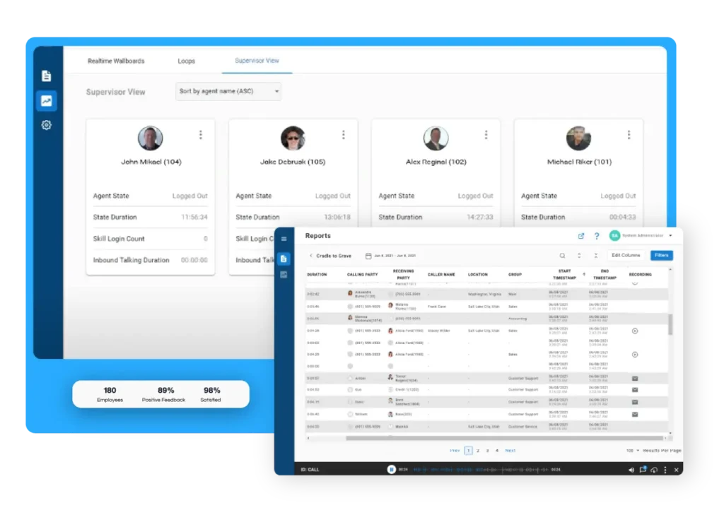
Somewhere in your contact center right now, a supervisor is toggling between three different screens trying to figure out why call abandonment spiked an hour ago. The data exists. It’s just scattered across systems that don’t talk to each other. Xima gives supervisors real-time dashboards that pull contact center KPIs into a single view, so you can spot problems and coach your team before small issues become big ones.
This article covers six essential contact center dashboards every supervisor should have running. You’ll learn what each dashboard tracks, why it matters for first contact resolution (FCR) and average handle time (AHT), and how to use the data to improve your team’s performance day over day.
Quick guide: 6 contact center dashboards for supervisors
- Real-time queue monitor: A straightforward way to track active calls and wait times across queues
- Agent performance dashboard: Tracks individual agent metrics for handle time and call outcomes
- First contact resolution tracker: Monitors FCR rates by agent, team, and issue type
- Abandoned call dashboard: Shows where and when callers hang up before reaching an agent
- Service level wallboard: Displays live service level percentages against your targets
- Sentiment and QA dashboard: Captures call quality scores and customer sentiment trends
How we chose the best contact center dashboards for supervisors
Contact center supervisors need dashboards that show what’s happening right now, not what happened last week. The difference between a contact center that runs smoothly and one that constantly plays catch-up often comes down to how quickly supervisors can access the right metrics and take action.
Here’s what we looked for when selecting these dashboards:
- Real-time data refresh: You need current information to make staffing decisions and intervene on problem calls, not stale data that’s hours old
- FCR and AHT visibility: These two metrics directly impact customer satisfaction and operational costs, so they should be front and center
- Cradle-to-grave tracking: Seeing the complete journey of each interaction, from first ring to final wrap-up, gives you the full picture of what’s happening on calls
- Agent-level drill-down: Aggregate numbers are helpful, but you need the ability to see individual agent performance to coach effectively
- Customizable views: Every contact center has different priorities, so dashboards should let you configure what metrics appear and how they’re displayed
- Low training requirements: If your supervisors need a week of training to read a dashboard, it’s not going to get used
The 6 contact center dashboards supervisors need
1. Real-time queue monitor: Track active calls and wait times
A real-time queue monitor shows you exactly what’s happening in your queues at this moment. You can see how many calls are waiting, how long they’ve been holding, and which agents are handling interactions. This immediate visibility lets you make staffing adjustments before wait times escalate.
When your queue monitor shows wait times climbing past your threshold, you have time to pull in additional agents or activate overflow routing. Xima’s real-time dashboards update second by second, so the numbers you’re seeing reflect current conditions, not where things stood five minutes ago.
Real-time queue monitor features
- Live call counts by queue: See at a glance which queues are busy and which have capacity
- Wait time thresholds: Set visual alerts that change color when wait times exceed your targets
- Agent status overview: Know which agents are on calls, in wrap-up, or available to take the next interaction
Real-time queue monitor pros and cons
Pros:
- Immediate visibility into queue conditions enables faster supervisor response
- Visual alerts help prioritize attention during high-volume periods
- Agent status tracking supports real-time staffing decisions
Cons:
- Queue monitors show current state but don’t predict future volume. Pair with forecasting for planning
- High refresh rates can be distracting if thresholds aren’t set appropriately
- Requires consistent monitoring to capture issues as they develop
2. Agent performance dashboard: Individual metrics that drive coaching
Aggregate numbers tell you how your contact center is performing. Agent-level dashboards tell you who needs coaching and where. A good agent performance dashboard breaks down handle time, hold time, wrap-up time, and call outcomes by individual, so you can have specific conversations about improvement areas.
Xima’s agent dashboards show not just the numbers, but the trends. You can see whether an agent’s AHT has been improving over the past month or if a recent policy change has caused handle times to spike across the team.
Agent performance dashboard features
- Individual AHT breakdown: See talk time, hold time, and wrap-up time separately for each agent
- Call outcome tracking: Monitor transfers, escalations, and resolved-on-first-contact rates by agent
- Trend comparisons: Compare current performance to historical baselines
Agent performance dashboard pros and cons
Pros:
- Specific data supports targeted coaching conversations
- Trend visibility shows whether coaching interventions are working
- Identifies both high performers and those who need additional support
Cons:
- Metrics alone don’t explain why performance varies. Review call recordings for context
- Overemphasis on individual metrics can create unhealthy competition if not managed carefully
- Some agents may need context about how metrics connect to customer outcomes
3. First contact resolution tracker: Measure what customers care about most
First contact resolution directly impacts customer satisfaction. When customers have to call back about the same issue, satisfaction scores drop and your operational costs double. An FCR dashboard tracks how often issues are resolved on the first interaction and identifies patterns in repeat contacts.
The challenge with FCR measurement is defining what counts as resolution. Xima’s cradle-to-grave tracking helps by connecting related interactions, so you can see when the same customer contacts you multiple times about the same issue, even if those contacts happen days apart.
First contact resolution tracker features
- FCR rates by agent and team: Identify who’s resolving issues effectively on first contact
- Repeat contact analysis: Track which issues most commonly require follow-up calls
- Resolution categorization: Tag calls by outcome type to understand what’s driving callbacks
First contact resolution tracker pros and cons
Pros:
- Directly measures what matters most to customer satisfaction
- Identifies training opportunities around specific issue types
- Connects individual performance to business outcomes
Cons:
- FCR calculation requires clear definitions of what constitutes a repeat contact
- Some issues legitimately require multiple contacts and shouldn’t count against FCR
- Customer behavior (calling back before resolution is complete) can skew numbers
4. Abandoned call dashboard: Find where customers give up
Every abandoned call represents a customer who needed help and didn’t get it. An abandoned call dashboard shows you when abandonment happens, at what point in the wait customers give up, and which queues have the highest abandonment rates.
This data is crucial for staffing decisions. If you see abandonment spike at 2 PM every day, you know you need more coverage during that window. If one queue consistently has higher abandonment than others, you need to investigate whether it’s a staffing issue or a routing problem.
Abandoned call dashboard features
- Abandonment rate by time of day: Identify patterns that indicate staffing gaps
- Time-to-abandonment tracking: See how long customers wait before hanging up
- Queue-level comparison: Compare abandonment across different queues and skill groups
Abandoned call dashboard pros and cons
Pros:
- Clear visibility into where customers are giving up
- Supports data-driven staffing and scheduling decisions
- Helps justify additional resources when abandonment is high
Cons:
- Abandonment rate alone doesn’t explain why customers hung up
- Short-abandonment calls (under 10 seconds) may be misdials, not frustrated customers
- Seasonal patterns require longer data collection to identify accurately
5. Service level wallboard: Live performance against targets
A service level wallboard displays your key metrics in a format everyone can see, supervisors, agents, and operations leadership. Mounted on screens throughout your contact center, these wallboards keep your service level targets visible and create shared awareness of how the team is performing.
Xima’s wallboards are customizable, so you can display the metrics that matter most to your operation. Some teams focus on service level percentage (calls answered within threshold). Others add current wait time, calls in queue, and agent availability.
Service level wallboard features
- Live service level percentage: Shows what percentage of calls are being answered within your target time
- Threshold alerts: Visual cues (color changes) when performance drops below acceptable levels
- Multi-queue display: Monitor several queues on a single wallboard view
Service level wallboard pros and cons
Pros:
- Creates shared visibility and accountability across the team
- Agents can self-regulate when they see queue conditions changing
- Leadership gets at-a-glance performance status without requesting reports
Cons:
- Wallboards require physical screens or monitors for maximum visibility
- Too many metrics on one display can make it hard to identify what needs attention
- Agents may feel pressured if metrics are displayed too prominently without context
6. Sentiment and QA dashboard: Quality beyond the numbers
Handle time and FCR tell you about efficiency. A sentiment and QA dashboard tells you about quality. By tracking customer sentiment during calls and scoring interactions against your quality standards, you get visibility into the experience your contact center is actually delivering.
Xima’s AI-powered speech analytics evaluate 100% of interactions, not just the handful a supervisor can manually review each week. This means you catch quality issues faster and can identify coaching opportunities based on actual call patterns instead of random sampling.
Sentiment and QA dashboard features
- Automated QA scoring: AI evaluates calls against your quality criteria without manual review
- Sentiment trend tracking: See whether customer sentiment is improving or declining over time
- Flagged interaction alerts: Get notified when calls score below threshold so supervisors can review and coach
Sentiment and QA dashboard pros and cons
Pros:
- 100% call coverage eliminates the sampling bias of manual QA
- Sentiment analysis adds context that pure metrics miss
- Faster identification of coaching opportunities
Cons:
- AI scoring requires calibration to match your specific quality standards
- Sentiment detection may misinterpret sarcasm or industry-specific language initially
- Human review is still valuable for nuanced coaching conversations
Comparison table: Contact center dashboards for supervisors
| Dashboard Type | Cradle-to-Grave Tracking | AI-Powered QA | Custom Wallboards |
|---|---|---|---|
| Real-time queue monitor | No | No | Yes |
| Agent performance dashboard | Partial | No | Yes |
| FCR tracker | Partial | No | No |
| Abandoned call dashboard | No | No | Yes |
| Service level wallboard | No | No | Yes |
| Sentiment and QA dashboard | No | Yes | No |
What metrics should contact center supervisors track daily?
The metrics you monitor daily should balance efficiency, quality, and customer experience. At minimum, supervisors should track current service level, calls waiting in queue, average wait time, and agent availability. These numbers tell you whether you have the right staffing in place right now.
Beyond real-time metrics, review AHT trends and FCR rates at the team level daily. If AHT is climbing, investigate whether it’s a training issue, a policy change, or a system problem causing agents to spend more time on calls. If FCR is dropping, look at what types of issues are generating callbacks.
Xima makes daily metric review straightforward by consolidating these KPIs into configurable dashboards. Instead of logging into multiple systems or waiting for reports, supervisors can see their key numbers in a single view and drill down when something needs attention.
How do real-time dashboards improve first contact resolution?
Real-time dashboards improve FCR by giving supervisors the visibility to intervene before problems escalate. When you can see that an agent has been on a call for twice the normal handle time, you can listen in or send a message offering support. That intervention might be the difference between a resolved call and a frustrated customer who calls back tomorrow.
Real-time queue visibility also supports better routing decisions. If your technical support queue is overloaded while general inquiries are slow, you can redirect agents with the right skills to where they’re needed. Customers get to knowledgeable agents faster, and those agents are more likely to resolve issues completely.
Xima’s real-time dashboards update continuously, so the information you’re acting on reflects what’s happening right now. Combined with cradle-to-grave tracking, supervisors can see not just that a call is taking a long time, but what’s happened during that call, transfers, holds, conference calls, and make informed decisions about how to help.
Why Xima is the right platform for contact center supervisors
Most contact center supervisors spend too much time hunting for data and not enough time using it. Xima changes that by bringing cradle-to-grave reporting, real-time wallboards, and AI-powered quality assurance into a single platform that supervisors can actually use without a data science degree.
The difference shows up in how quickly you can answer questions. When leadership asks why abandonment spiked last Tuesday, you can pull the data in minutes instead of hours. When an agent asks why their AHT is higher than their peers, you can show them exactly where the time is going. When you need to justify additional headcount, you have the documentation to make the case.
Xima was built for contact centers that need enterprise-grade analytics without enterprise-level complexity. The interface is designed for supervisors, not IT teams, and the reporting connects to the CRM and EHR systems your business already runs on. Ready to see how it works? Request a demo and see what real-time supervisor visibility looks like for your contact center.
FAQs about contact center dashboards
What is the difference between a dashboard and a report in a contact center?
A dashboard shows real-time or near-real-time data that updates automatically, while a report captures data from a specific time period for later review. Dashboards help supervisors make immediate decisions, like adjusting staffing when wait times climb. Reports help with trend analysis and planning. Xima supports both, so you can monitor live conditions and schedule historical reports.
How often should contact center dashboards refresh?
For operational dashboards like queue monitors, refresh rates of every few seconds are standard. Supervisors need current data to make staffing decisions and intervene on problem calls. For performance dashboards showing daily metrics, updates every 15 to 30 minutes are typically sufficient. Xima’s wallboards refresh continuously for real-time visibility.
Can supervisors customize their contact center dashboards?
Yes, and customization matters because every contact center has different priorities. Xima lets supervisors build custom dashboards with the metrics they care about most, arranged in the layout that makes sense for their workflow. You can also create role-based views, one dashboard for supervisors, another for operations managers.
What is cradle-to-grave reporting?
Cradle-to-grave reporting captures every step of an interaction from the moment it enters your system until it’s resolved. This includes initial queue time, transfers between agents or departments, hold time, and wrap-up. Xima tracks this complete journey, so you see the full picture instead of fragmented call segments.
How do dashboards help reduce average handle time?
Dashboards give supervisors visibility into which agents have high handle times and where that time is being spent, talk time, hold time, or wrap-up. With this data, supervisors can have specific coaching conversations and identify process issues that slow agents down. Xima’s real-time monitoring also lets supervisors intervene during long calls to help agents resolve issues faster.